I like to define accessibility as an answer to “How many barriers are there to acquire or utilize information in a particular context?”. Something being perfectly accessible means that the entire population can use it – emotionally, cognitively or behaviourally.
Let’s turn this abstract into something more concrete – let’s talk about digital accessibility. Most of the stuff you read and use on your desktop or mobile devices are documents, with varying level of interactivity baked in. There are some very loud voices proclaiming personal offence when someone claims that their fintech app is a “document”, but the reality is just that — the Web is made of documents. When you see the words “application”, “document”, “page” in the rest of this writing, you can safely assume I’m talking about the stuff you see on your screen when you use the internet, no matter whether through browser or native mobile app.
The separation
Building on the previous, let’s delve into what these documents are made of:
- Content — the semantic load of the document, all the meaning behind words and pictures, hidden in sounds, in motion and video on your page. I’ll stress that part again — words on the page are not the content, the meaning of these words is the content of your page
- HTML — markup language that is used to define the meaning of elements on the page, e.g. is this part of text a navigation link, or an article’s heading. It also contains data necessary to determine the meaning of non-text content, such as images, through text alternative to visual elements
- Presentation — the set and setting of the page, the fonts and colours, the spatial and temporal dimensions of information.
- CSS — styling language that allows for, well, styling of the page, building layouts and adjusting the presentation to the user’s device size (or defining a different presentation for printing)
- Interactivity — the means through which the content or presentations shifts in time, or through which the user can add, change, or remove elements of the page.
- JavaScript — scripting language that can change content and presentation when prompted by the user, or through some pre-defined algorithm.
- HTML+CSS — scripting languages aren’t always needed, since this combination is Turing-complete by itself. I don’t mean that JS is inherently detrimental to accessibility (or the opposite). Select the correct tool for the job at hand. If you always hold a hammer in your hand, everything will be a nail to you.
The bad or the ugly?
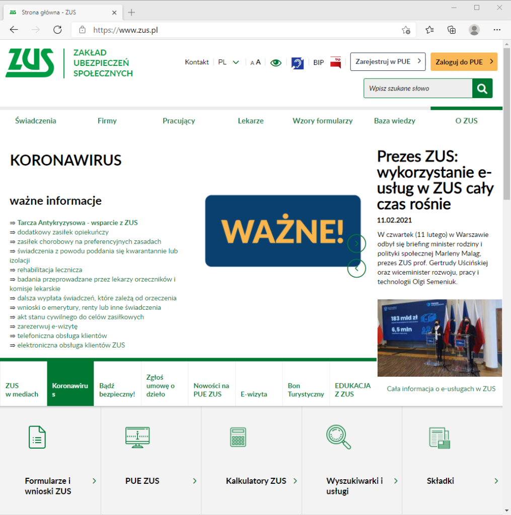
Accessibility is often thought of as of something that is for people with disabilities (or government pages), an “add-on” to the page, just so the less fortunate can use it. That is a backwards approach that can only result in bad products, that are neither for people with disabilities nor for people without them. Let’s look at the page of Polish Social Insurance Agency:

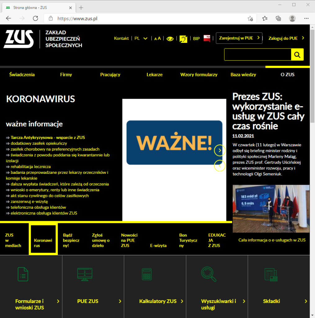
Looks a bit better than Chernobyl’s 3.6 Roentgen, I guess. Now, for the “accessible” version (if you want to replicate the look, select the link with an ID of “#highContrastMode”, it’s the icon that looks like an eye):

So, let me get this straight — there’s an added bloat of buttons on the page that are meant to improve accessibility when prompted by the user, and this is what I get? Why should I even bother with this “accessibility” thing if following its rules makes for such horrible pages?
Here, I found this page belonging to the Norwegian government, look at it, it’s beautiful, it’s clear, concise, no extra buttons:

Now dropping the silly talk — yeah, that’s accessible. No extra buttons, no bullshit “high-contrast modes”, just a good, robust experience for all users. This difference is why one must start with the separation of content and presentation.
The standards
Accessible doesn’t mean bloated, ugly, or precluding artistic expression. It means “How can we ensure that the user experience with our product is of quality, is robust, and is for the broadest audience possible?”. It’s about building a product that will stand the test of time. Such predictability can be found in products and processes that adhere to chosen standards. When it comes to digital accessibility, there is some confusion as to what these standards are. For example, let’s have a look at this post from one of Reddit’s admins, it’s an answer to being called out on new Reddit’s redesign being inaccessible:
The websites they linked to in the post are:
- Section 508 — US government legislation, full name “Section 508 Amendment to the Rehabilitation Act of 1973”. Not an accessibility standard
- WCAG 2.0 — an older version (current at the time of the ggAlex’s post) of Web Content Accessibility Guidelines. It is in fact an accessibility standard
- WAI-ARIA — the Accessible Rich Internet Applications Suite. It is a standard that describes how to extend the HTML, so it can fulfil the WCAG requirements when the pure HTML is not enough
One of these was not an accessibility standard, but rather a law that requires accessibility to be a part of digital experiences in the US. Similar to these, you can find an EN 301 549 norm (codified in (EU) 2016/2102 directive) in the EU.
For the purposes of building accessible digital experiences, the actual guidelines one needs to follow are the WCAG and WAI-ARIA. Let’s have a bird’s-eye view look at what they entail.
WCAG
The WCAG is divided into 4 sections, describing requirements for the principles of accessibility:
- Perceivable — users must be able to perceive the information and the UI. In practise, it requires content to be structured in such a way that its meaning can be programmatically determined. The rule of thumb here is:
- a person can get the same information from the page using their eyes or a screen reader software
- Operable — users must be able to operate the UI. In practise, it requires the UI element’s functions to be triggerable by any kind of input tool. The rule of thumb here is:
- a person can get from point A to point B on the page, using the page’s UI, and acquire equivalent information along the way, no matter if they use only a mouse, a keyboard, or a touch interface
- Understandable — users must be able to understand the content and the UI. In practise, it shares the “meaning can be programmatically determined” with the Perceivable principle. The rule of thumb here is:
- the UI is consistent and predictable (that doesn’t mean identical, mind you) across the multiple pages on the same website
- the content related to the user actions, such as error messages, labels and instructions is clear, concise, and helpful
- the content in general written (as a default text, or text alternative) so the largest possible part of its intended audience will understand it
- Robust — the content is structured and described in such a way that it adheres to the standards, so user agents (such as screen readers) can correctly interpret it. The rule of thumb here is:
- Use default HTML semantics
- If the default HTML semantics are not enough, use ARIA
- JavaScript ain’t evil, but also ain’t replacement for HTML and ARIA
WAI-ARIA
Sometimes HTML is not enough. One of the more common examples is making an accessible, easy-to-style combobox (if you’re looking for one, Sarah Higley has some great ones). Since it’s a custom component and not a part of HTML spec, you need to build it by yourself in such a way that it’s functionally and semantically equivalent to the <select> element in HTML. ARIA will allow you to define the required properties:
- role — what role does the element play in the document, how it relates hierarchically to the other elements on the page (e.g. listitem should be a part of a list) and what states and properties can it have
- states and properties — what is happening right now with the element. Say we have an element that has a role=”button”. It can be in an aria-pressed=”true” state (when it’s currently, well, pressed), with an aria-label=”I am a custom button” property.
But you should avoid making buttons with ARIA. Doing a glance at the code once again <div role=”button” aria-pressed=”true” aria-label=”I am a custom button”> (plus some JS for functionality), there’s something missing. Something related to the operable WCAG principle. I might be able to use it by clicking on it. The same for tapping on it on a touchscreen. But I won’t be able to use it with my keyboard, since it lacks a tabindex=”0″ attribute.
Making your own components is a mess. Sometimes, an unavoidable mess. This is what the standards are there for — so you won’t have to think about all the roles, states, properties, attributes. Just plain, simple HTML.